Tips for Developing an Amazing Website for your Direct Primary Care Practice
As a primary care doctor, you are unlikely to have any history of building a website or creating content online, and THAT IS OKAY. You don’t need to know how to write code, and you don’t need to know how to do complicated tasks online. However, you should know how to use a service like SquareSpace or Wix or GoDaddy to build your own website.
I like using SquareSpace, and both my PlumHealthDPC.com and this StartupDPC.com are built on the SquareSpace platform. It takes anywhere from 2 to 8 hours to build a decent website. You have to choose a theme and select the pages that you want. Some companies are going to a “one page website” where you have all of your information on one page without clicking to other pages. This would greatly simplify your web-building process.
However, as you can see, I take a more traditional or typical approach to my website. I have a main page, an about page, an FAQ page, a blog page, and then my schedule/enroll page. This meets the expectations of most of my potential customers and allows them to easily engage with my content.
I can also write many blog posts and add that information to my blog page, which increases my traffic and search engine optimization.
Search engine optimization is the process of improving the quality and quantity of website traffic to a website or a web page from search engines. SEO targets unpaid traffic rather than direct traffic or paid traffic.
I have a lot of doctors ask me to develop their website for them. I charge $3,000 for this service as it takes a good amount of time and there is a decent amount of back-and-forth to get things just right for the doctor. Most good web designers charge this amount of money, and you can find someone to do the work for you on a site like Fiverr or UpWork or a similar free-lance friendly website.
I will say, your website is the most important part of your business. It’s the front door to your business, and it acts to attract new patients and enables them to enroll seamlessly. You must have an excellent website that is easy to use and does not have any broken links.
On a final note, I’m taking a digital marketing course right now to improve my digital marketing skills, and this was one of the topics: how to improve your website!
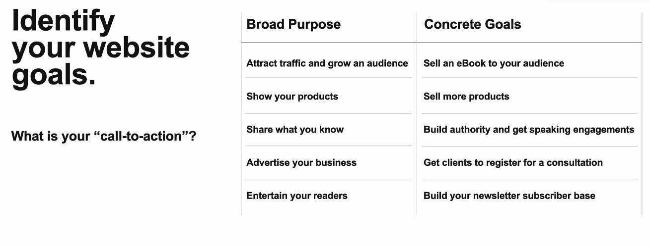
When you are building your website, it’s important to identify the goal of your website. For my Plum Health DPC website, my goal is to get more people to enroll in our direct primary care service. We achieve this goal by writing content on our blog to improve search engine optimization, and then sharing that content on our social media channels and back-linking to our blog to attract new readers, who hopefully become new members.
When you are building your website, it’s important to identify the goal of your website. For my Plum Health DPC website, my goal is to get more people to enroll in our direct primary care service.
Additionally, your website should be easy to navigate - as the old saying goes, keep it simple silly! If you have too much information, a cramped and crowded website, it may drive people away. Having enough white space allows your website to breathe and your potential customers to feel relaxed as they read through your information.
You should have your logo on each page, as that can add more credibility and professionalism. You should choose fonts and colors that complement your brand and your logo. I like to include videos and multimedia - written content paired with images and videos can help communicate the information to different audiences who consume information in different ways.
Additionally, your website should be easy to navigate - as the old saying goes, keep it simple silly! If you have too much information, a cramped and crowded website, it may drive people away. Having enough white space allows your website to breathe and your potential customers to feel relaxed as they read through your information. You should have your logo on each page, as that can add more credibility and professionalism. You should choose fonts and colors that complement your brand and your logo. I like to include videos and multimedia - written content paired with images and videos can help communicate the information to different audiences who consume information in different ways.
Thanks so much for reading! If you love this content, then check out our Sales Funnel course, where I go in-depth on how to attract more patients to your direct primary care practice. As a big hint, you need to have content on your website and a seamless way to enroll on your website to achieve this goal.
Have a great week!
-Dr. Paul Thomas with Startup DPC and Plum Health DPC in Detroit, Michigan

